PROJECT: Editorial Layout
CLIENT: PHCP
PHCP (Patrick Henry Creative Promotions) is in the hospitality industry — specifically to help support their clients with promotions and a multitude of services such as: beverage program consulting, strategy development, mixology, graphic design, etc. With their clients top of mind, PHCP also sends out a quarterly newsletter that talks about whats on the up and up in the industry and is written and designed by the PHCP staff.
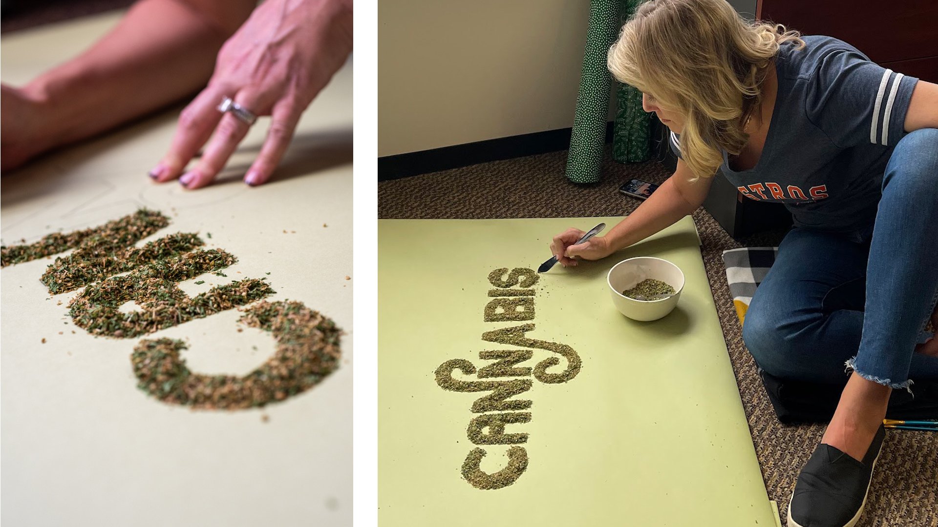
I saw an opportunity with this newsletter to try my hand at something I’d been thinking about for a long time. Like most designers, I’m a big fan of hand-lettered type; but specifically, a real life, dimensional, tactile type. Type that is molded by your hands. It’s nice to get away from the computer sometimes, so for this article, I experimented in creating dimensional type for an article on cannabis. I enjoyed pushing my limits and taking on something out of the norm in my day-to-day design work. My ulterior motive with this was also to show the clients of PHCP something different that perhaps I could work into a future project.


